




Minnesota Vikings Logo and Colors
The Minnesota Vikings have changed stadiums, uniforms and generations of players since joining the NFL in 1961. The face watching over the franchise has remained largely the same.
A blond Norseman wearing a horned helmet became part of the team's identity before Minnesota played its first game. More than six decades later, the same profile remains on team clothing, stadium signs, broadcasts and merchandise.
The drawing has been cleaned and adjusted, but it has never been replaced. Purple and gold have survived with it.
Four open ink containers
Pull the first print
Everything below is already on the sheet, the screen is only there for the pleasure of watching it pass. Nothing on this page is hidden behind the button.
What does the Minnesota Vikings logo look like?
The primary Minnesota Vikings logo shows the side profile of a blond Norseman facing to the right.
Its main features
- A purple and gold horned helmet
- Two white horns with black outlines
- A gold moustache
- A long gold braid
- A pale face
- Heavy black outlines
- A determined expression
The team also uses a separate horn symbol, most visibly on its helmets. Each side of the purple helmet carries a white Viking horn outlined in gold.
The Norseman is the broader team symbol. The horn creates a simpler mark that can be recognised from a distance and fitted naturally to the shape of a football helmet.
Four printing screens
These four screens are a schematic demonstration of how a four-colour screen print builds up. They carry plain geometric shapes in the team's four ink colours, not parts of the Vikings trademark. The mark itself is a protected design and is never separated into components on this page.
The finished print
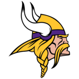
The current Norseman, shown here whole and unaltered as the subject of this article.
The Minnesota Vikings name, the Norseman logo and the Vikings helmet horn are registered trademarks of the Minnesota Vikings Football, LLC. They appear here for identification and commentary only. This is an independent fan site with no affiliation to, or endorsement from, the Minnesota Vikings or the NFL.
What each screen carries
In a real four-colour separation of the Norseman, the inks would divide like this:
Sheet one, Black
Outline, eye, helmet divisions and facial definition.
Sheet two, Gold
Hair, braid, moustache and helmet details.
Sheet three, Purple
Helmet band and principal team colour.
Sheet four, White
Horns and open areas.
Minnesota Vikings color codes
The Vikings' principal colors are purple, gold and white. Black is used for outlines, contrast and selected uniform details.
Select the purple and gold inks together to bring out a uniform fabric sample between them.
Vikings purple
The dominant colour of the identity since 1961.
Purple and gold together, the combination established before Minnesota's inaugural 1961 season.
Vikings gold
The accent that keeps the purple from reading too heavy.
White
The horns, the road jersey and the breathing space.
Black
Outlines, contrast and selected uniform details.
| Color | Hex | RGB | Common Pantone reference |
|---|---|---|---|
| Vikings purple | #4F2683 | 79, 38, 131 | PMS 268 C |
| Vikings gold | #FFC62F | 255, 198, 47 | PMS 123 C |
| White | #FFFFFF | 255, 255, 255 | White |
| Black | #000000 | 0, 0, 0 | Black |
The purple and gold values are commonly listed in professional team-colour references, including Team Color Codes.
Anyone producing licensed merchandise, commercial advertising or official team material should obtain the current brand specifications and approved artwork from the Vikings or NFL. Screen values can vary from print specifications, fabric dyes and broadcast colours.
Why are the Vikings purple and gold?
The choice dates back to the creation of the franchise.
Bert Rose became the Vikings' first general manager after previously working with the Los Angeles Rams. Rose had attended the University of Washington, whose athletic teams also use purple and gold.
When Minnesota's new professional football team needed its own identity, Rose selected a similar colour combination.
Purple offered something distinctive. Only a small number of major professional teams were strongly associated with the colour, allowing Minnesota to stand apart from the many clubs using red, blue or green.
Gold provided contrast and connected naturally with the Norseman's hair, moustache, helmet and braid.
The combination was established before Minnesota's inaugural 1961 season and has remained central to the franchise ever since.
Purple as the main team color
Purple does most of the identity work for Minnesota.
It covers the home jersey, helmet, many stadium surfaces and most team graphics. It is also used by supporters throughout U.S. Bank Stadium.
The colour has inspired several familiar expressions and nicknames:
- Purple People Eaters
- Purple Pride
- Purple Territory
- Purple and Gold
Because the Vikings have used purple since 1961, the colour can represent the team even without a logo or wordmark.
A solid purple background with small gold details is often enough for supporters to identify the subject immediately.
The purpose of Vikings gold
Gold is usually an accent rather than the dominant colour. It appears in:
- Logo hair and facial details
- Helmet horn outlines
- Jersey and number trim
- Gloves, shoes and accessories
- Stadium graphics
- Merchandise
- Digital buttons and highlights
The colour brings warmth to the darker purple and prevents the identity from appearing too heavy.
For digital layouts, gold works best on larger headings, borders, icons and selected numbers. Long paragraphs in bright gold are difficult to read, especially against white backgrounds.
Gold is used here for fills, rules and icons only. Bright gold text on the cream studio background falls well under the accepted contrast minimum, so every word you read is set in printing black or Vikings purple.
White and black
White is an essential part of the horn symbol and the Vikings' road uniforms. It also provides space and contrast in digital and printed designs.
Black is used more carefully.
It creates the outlines that hold the Norseman illustration together. Black also separates the helmet, face, horns, hair and moustache when the mark is reduced to a smaller size.
Although black appears in alternate clothing and supporting graphics, it should not replace purple as the main colour of a traditional Vikings design.
Who designed the Vikings logo?
Los Angeles sports cartoonist Karl Hubenthal designed Minnesota's original logo, helmet and uniform.
Drawing surface, blank. The 1961 Hubenthal artwork is not held on this server and is not reproduced anywhere on this page. What follows describes it in words.
KARL HUBENTHAL
Los Angeles Examiner
Editorial cartoons and sports illustration
Commissioned 1961: logo, helmet, uniform
The commission
Hubenthal worked for the Los Angeles Examiner and was known for editorial cartoons and sports illustrations. Rose and the Vikings' first head coach, Norm Van Brocklin, knew him from their earlier connections to the Los Angeles Rams.
Hubenthal was asked to create the visual identity for the new Minnesota team in 1961. His work included:
- The original Norseman profile
- The horned football helmet
- The purple and gold colour combination
- The early uniform structure
- The numbers and sleeve treatment
The designs were strong enough to survive changes that usually cause professional sports teams to replace their early branding.
Minnesota has modernised the artwork, but the basic idea created by Hubenthal remains visible in the current identity.
The original 1961 Norseman
The first Norseman was more detailed and illustrative than many modern sports logos.
He wore a gold helmet with a purple band. Two white horns extended from the helmet, while blond hair appeared beneath it. A long moustache and braid completed the profile.
The drawing used heavy black lines to separate the face, hair and helmet. Additional strokes created shadows and texture.
This level of detail made sense for an image created by a cartoonist. It gave the character expression and made him feel less like a symbol assembled from basic shapes.
The design also connected directly to the team name. A fan seeing the image did not need accompanying text to understand that it represented a Viking.
This fan site holds no copy of the 1961 Hubenthal drawing, and drawing an approximation of it would produce a fake historical artifact rather than a record of one. The desk is therefore shown mid-job, with the drawing surface left blank and the description carried by the pinned notes. Readers who want to see the original artwork should consult the team or a licensed archive.
What changed in the 2013 logo?
The Vikings introduced a refined version of the Norseman on February 14, 2013.
It was not a replacement. The team preserved the same character, direction, colours and overall silhouette while cleaning the drawing for modern use.
Tracing sheet: the 1961 Norseman, described
- A gold helmet with a purple band.
- Two white horns extending from the helmet, longer and less controlled than today's.
- Blond hair beneath the helmet, in a softer gold than the current mark.
- A long moustache and a long braid completing the profile.
- Heavy black lines separating face, hair and helmet, plus extra thin strokes for shadow and texture.
This sheet carries words, not artwork. The 1961 drawing is not reproduced on this page, pull the handle back to the left and the current mark is the only image on the table.
The five main changes
Shorter horns
The horns became slightly shorter and more controlled.
Revised horn bases
Their bases were also changed to resemble the horns used on Minnesota's football helmets.
A shorter braid
The braid was reduced so the logo occupied a tighter and more balanced space.
Thicker facial lines
The face and moustache received heavier outlines. This helped the details remain visible when the logo appeared at smaller sizes.
Brighter gold
The hair, moustache, braid and helmet received a brighter gold treatment. Several thin black strokes used for shadow and texture were removed, and solid shapes replaced some of the older illustrated details.
The NFL's announcement of the 2013 Norseman update described it as a facelift rather than a complete redesign.
A true before-and-after would place the 1961 artwork beside the 2013 artwork. Only the current mark exists on this server, so the 2013 Norseman is shown intact and the 1961 version is carried entirely in words. Nothing on this table is an approximation of the historical drawing.
Minnesota Vikings logo history
The logo's history can be divided into two principal periods.
| Period | Main design |
|---|---|
| 1961 to 2012 | Original Karl Hubenthal Norseman |
| 2013 to present | Refined Norseman with cleaner lines and shorter details |
Many sports franchises have moved through several unrelated symbols. Minnesota has instead protected the recognition built by the original design.
The 2013 version still looks unmistakably connected to 1961. A supporter from the Bud Grant era and a supporter attending a current game can recognise the same face.
The horn helmet logo
Minnesota's helmet uses a separate pair of white horn graphics rather than the full Norseman.
The rotation control only moves when you press a button. Nothing on this page animates by itself.
Each horn begins near the side of the helmet and curves towards the back. A gold outline separates the white horn from the purple shell.
The design takes advantage of the helmet's shape. From the front, the two graphics appear to form a pair even though each side carries a separate mark.
The horn is one of the simplest elements in Minnesota's identity, but it may be the most visible during games. It can be recognised when the full Norseman would be too detailed to read.
The team slightly refined the helmet horn in 2006. Its shape became cleaner and more defined while preserving the original idea.
The helmet is part of the identity
Minnesota has worn a purple helmet throughout its history. That consistency is important because the helmet links every era of the franchise:
- Fran Tarkenton and the 1960s teams
- The Purple People Eaters
- Four Super Bowl appearances
- The Metrodome years
- Randy Moss and the 1998 offence
- Adrian Peterson's rushing career
- The move to U.S. Bank Stadium
- Justin Jefferson and the current generation
Uniform details have changed around it, but the purple helmet and white horns have remained.
The finish has not always looked identical. Different materials, lighting and production methods have made some helmets appear lighter, darker, glossier or more matte. The underlying identity has stayed consistent.
The crescent shapes in the diagram opposite are generic forms drawn to explain placement. The Vikings helmet horn is a protected trademark and is not redrawn here.
The meaning behind the Norseman
The Norseman reflects Minnesota's connection to Scandinavian-American history.
Large numbers of immigrants from Norway, Sweden and Denmark settled in Minnesota during the nineteenth and early twentieth centuries. Scandinavian traditions became part of the state's food, place names, festivals and community history.
The team name was selected to represent that regional connection while also suggesting strength, exploration and toughness.
The logo turns those ideas into a single character.
Its horned helmet is part of the popular image of Vikings used in entertainment and sport. Historical Norse warriors are not generally believed to have worn horned helmets in battle, but the image had already become a familiar visual symbol by the time Minnesota's logo was created.
The mark should therefore be understood as a sporting character rather than a historically exact reconstruction.
How the uniforms have changed
Minnesota's earliest uniforms established a format that remains familiar today.
Pull down a roll to read the period it covers. Each roll opens with the keyboard as well as the mouse.
Traditional purple wool texture
1961 to 2005
The team wore purple jerseys at home, white jerseys away, white pants and gold trim. Sleeve stripes and traditional football numbers gave the uniform a clear 1960s appearance.
Panelled performance fabric
2006 to 2012
The first major redesign arrived in 2006. New panels and trim lines were added across the shoulders, sleeves and sides. Purple pants became another option, while the horn graphic on the helmet was refined.
Clean matte fabric
2013 to present
Minnesota changed direction again in 2013. The team introduced a cleaner uniform with less complicated side panelling, distinctive number shapes and matte purple helmets.
Although the construction changed, the essential elements did not:
- Purple remained dominant
- Gold continued as the main accent
- White provided contrast
- The horn remained on the helmet
- The Norseman remained the primary team logo
Does the Vikings logo have text?
No. The primary Norseman logo does not contain the team name, initials or location.
This separates it from a wordmark.
The Vikings also use text-based graphics containing "Minnesota Vikings" or the team's name in custom lettering, but these are separate assets. The Norseman is designed to stand on its own.
The lack of text makes the logo useful across several formats and languages. It can appear on clothing, apps, score graphics and stadium surfaces without requiring a second element to identify it.
The Vikings wordmark
The team wordmark presents the Vikings name in sharp, angular lettering.
Its pointed shapes complement the helmet horns and the aggressive expression of the Norseman. Purple is normally used as the principal colour, with gold, white or black providing contrast depending on the background.
The wordmark and Norseman may appear together, but they should not be treated as one permanent combined logo unless an approved version has been supplied.
Spacing is important. Placing text too close to the Norseman can make the braid, horn or moustache difficult to distinguish.
No copy of the Vikings wordmark is held on this site, and none is drawn here. The description above is written, not illustrated.
How the identity works at different sizes
Four printing tests, pinned side by side. This section demonstrates why the detailed Norseman and the simple horn serve different purposes.
Stadium sign
At this size every element of the drawing survives: the horns, the braid, the moustache and the black outlines all read clearly.
display size: largeHelmet horn
The simpler mark holds together at speed and at a distance, where the full Norseman would be too detailed to read. Shown here as a plain schematic crescent.
display size: medium
Mobile icon
Reduced to a tile, the heavier 2013 outlines are what keep the face and helmet from merging into a single shape.
display size: small
MINNESOTAOFFICIAL LICENSED
SIZE M
Merchandise label
At label size the mark sits beside type, so spacing matters: crowd it and the braid and horn stop separating.
display size: very smallCommon logo mistakes
Eight sheets on the rack. Four came out right, four came out wrong.
Distorting, mirroring or recolouring a protected trademark and publishing the result would itself be one of the mistakes this section warns about. Every faulty sample below is therefore printed with a neutral demonstration shape, a circle, a wedge and a bar, that belongs to nobody. The genuine Norseman appears on this page only whole, correctly coloured and correctly proportioned.
Proper colours
Specified purple, specified gold, black outlines intact.
Clear spacing
Nothing crowds the braid, the horn or the moustache.
Original proportions
Width and height scaled together, exactly as supplied.
High contrast
A solid, quiet field lets every internal line stay legible.
Stretched
The width and height should remain proportional. Stretching the artwork can distort the face, helmet and horns.Demonstration shape, not the Vikings logo.
Reversed direction
The Norseman normally faces to the right. Flipping the logo changes an established feature of the mark.Demonstration shape, not the Vikings logo.
Incorrect purple
A bright violet or blue-purple can make the mark look disconnected from the Vikings identity. Use the specified purple value when producing digital work.Demonstration shape, not the Vikings logo.
Busy photographic background
The details disappear when the logo sits over a complicated background. A solid or lightly textured purple, white or black field produces better contrast.Demonstration shape, not the Vikings logo.
Removing the black outlines
The outlines are part of the design. Removing them can cause the facial details and helmet elements to merge.
Rebuilding the mark from a small image
Low-resolution files often contain blurred edges or incorrect colours. Use approved artwork at an appropriate resolution.
Can fans use the Vikings logo?
The Vikings name, logo and uniform designs are protected trademarks.
Fans can generally display officially licensed merchandise and discuss the team using images in editorial or informational contexts. Commercial use is different.
A historical article can show the logo to identify and discuss it, provided the use is limited and does not imply endorsement. A clear editorial context and trademark notice are sensible additions.
For merchandise, sponsorships or commercial campaigns, permission should be obtained from the appropriate rights holder.
Rights and permissions
A person or company should not
- Sell products carrying the logo without permission
- Present an unofficial business as connected to the team
- Alter the mark and describe it as official
- Use the logo in advertising that suggests team approval
- Distribute downloadable logo files as unrestricted commercial assets
No logo downloads on this page
This page offers no SVG, PNG or EPS copy of the Vikings logo, no data-URI duplicate to save, and no hidden download. The single image used here is displayed at editorial size to illustrate the article, and that is the only role it plays.
If you need approved artwork, brand specifications or licensing terms, go to the rights holders directly.
The Minnesota Vikings name, the Norseman logo, the Vikings helmet horn and the Vikings uniform designs are registered trademarks of the Minnesota Vikings Football, LLC. NFL and the NFL shield are registered trademarks of the National Football League. Their appearance on this page is nominative and editorial. minnesotavikings.io is an independent fan site and is neither affiliated with nor endorsed by the Minnesota Vikings or the National Football League.
Why the Vikings identity has lasted
The logo succeeds because it combines a clear regional story with a distinctive shape.
The Norseman represents the team name without relying on letters. The horn works at a distance. Purple separates Minnesota from most of the league, while gold adds enough contrast to make the identity energetic.
Most importantly, the design can change without losing its origin.
The current Norseman has cleaner lines than the 1961 version. Modern uniforms use different construction and number shapes. Helmets have a different finish.
The face, horns, purple and gold remain.
Frequently asked questions
Nine sheets pegged out to dry. Open one to read its answer.
What is the Minnesota Vikings logo?
The primary logo is the side profile of a blond Norseman wearing a purple and gold horned helmet.
What are the Minnesota Vikings colors?
The principal team colors are purple, gold and white. Black is used for outlines and supporting details.
What is the Vikings purple hex code?
The commonly used digital hex value is #4F2683.
What is the Vikings gold hex code?
The commonly used digital hex value is #FFC62F.
Who designed the original Vikings logo?
Sports cartoonist Karl Hubenthal designed the original logo, helmet and uniform in 1961.
When did the Vikings change their logo?
The team introduced a refined version of the Norseman logo in 2013.
Why does the Vikings logo have horns?
The horns form part of the popular sporting image of a Viking. They also create the separate horn symbol used on Minnesota's helmets.
Is the Minnesota Vikings logo trademarked?
Yes. The team's name, logos and uniform designs are protected trademarks.
Has Minnesota ever replaced the Norseman?
No. The Norseman has been refined, but it has remained the Vikings' primary logo since the team's first season.
More Vikings reading
The uniform history above is the fullest version on this site. For the rest of the story: